After years of seeing sales and foot traffic dwindle, Sears Holdings Corp. has a new strategy for enticing shoppers: bringing back a print catalog.
The department-store chain will publish a 120-page “wish book” this holiday season, reviving a catalog that hasn’t been available since 2011. This time around, the 131-year-old retailer is going for something a little more high-tech. In addition to the print version, the publication is available in mobile and online versions.
The wish book is an attempt to capitalize on Sears’s heritage. But it also underscores how much has changed since the company was the world’s largest retailer. Sears has posted roughly $11 billion in red ink over the past six years, and it’s closing dozens of poor-performing stores. That will leave holiday shoppers with fewer places to visit this season.
Chief Executive Officer Eddie Lampert has generated cash by offloading real estate, along with the Lands’ End and Craftsman brands. The company’s strategy now hinges on signing up customers to Shop Your Way, a membership program that lets them build up rewards.
“Our members told us they missed the wish book, so we had to bring it back,” Kelly Cook, who runs marketing for Sears and sister chain Kmart, said in a statement.
The company’s holiday catalog debuted in 1933, when it was called the Sears Christmas Book. The original edition included a battery-powered car, fruitcakes and a doll called Miss Pigtails.
So what is Neuromarketing? It’s marketing that focuses on the brain. Since the brain makes all of our decisions, we should target our marketing there. Most current direct mail marketing is focused on upper brain function that involves reasoning, sometimes with emotion. This is the wrong approach. It involves too much thinking and is a turn off to many recipients. So let’s take a look at the brain and where we want to target our direct mail.
Our brain:
Upper Brain: Your upper brain is the high functioning smart brain. It is rational and processes information slowly. This is your conscious thought area and is somewhat controllable. This part of your brain is off when you are sleeping.
Middle Brain: This is where your emotions are. When emotions are triggered here, they get processed in the upper brain.
Lower Brain: This is the fast processing area of your brain, but it is limited to all your unconscious systems, heart, breathing, nerves and so on. This is the oldest part of the brain. This area focuses only on what is happening immediately. It is your auto pilot and is always on. We cannot control this part of our brain. This is all about system response such as fight or flight.
Now that you know what part of the brain controls what functions, you are ready to see where we should be targeting our direct mail. That target sweet spot is the lower brain. Since it deals with immediate processing and does so without our input, marketers have a better chance at eliciting a quick response when we can tap into that area of the brain. You have about five to six seconds for your message to be understood before the recipient moves on to something else. Because of that, you need to keep it simple.
How to target the lower brain:
Self — The lower brain is all about protection and is selfish. Tap into that with concise statements including the word "you."
Limited Choice — Provide a two-choice scenario, one where disaster strikes and the other where your product or service either prevents it or fixes the problem.
Connect — You need to connect your product or service with a real world example. This must be believable, not a far-fetched story.
Start/Finish — You need to start fast and effective, and end the same way. Limit the middle message so you don’t move to the upper brain.
Visual — You need to convey your messaging visually with images and graphics using a very limited amount of words. The eyes are the gateway directly to the lower brain; use that to your advantage!
Emotion — It is important to use emotion that starts out in a negative way and is solved by you in a way that creates positive feelings.
You need to factor all six of the above elements into your direct mail campaigns in order to reach the lower brain and increase your response. Direct mail is very visual, so keep your message simple and incorporate that into your images and graphics.
One more thing to keep in mind is to not overwhelm the brain with too many images or graphics. Give the eyes one focused focal point that gets your urgent message across fast.
Lastly, stay away from using numbers, they bring in the use of the upper brain. As with all marketing, direct mail works best when messaging is repeated, so find your focus and go after it.
Antiquated. Outdated. Unnecessary. Ask an inbound-only marketer about print collateral, and these are the words you might hear in response.
Meanwhile, marketers who see the big picture are using creative, conceptual leave-behinds to put a bow on their brand experience and make a tangible impression. With digital becoming the more prevalent marketing medium, there are moments when a high-touch piece of print collateral can make a surprisingly profound impact. Why?
Print Is Primal
People appreciate print collateral for the same reason they use handouts and take handwritten notes in meetings. Paper is ingrained in humanity, dating back to the earliest civilizations that used woven papyrus as a writing surface.
When creating brochures, mailers and other print marketing materials, graphic designers will often talk about creating collateral that “feels important.” Seeing a brochure on a screen doesn’t deliver the same tactile fulfillment as holding that very same brochure in your hand. We see millions of things on our screens each day and the digital overload dilutes the sense of importance in even the most memorable design.
We’re Not Talking About Folders And Sell Sheets
Before we go any further, let’s make one thing clear: As we pump up the marketing value of printed materials, we’re referring only to those that are unique, thoughtful and creative. A static folder with a few sell sheets does not qualify as impactful collateral. If you’re going to invest in print, make it amazing. Think sizes, shapes, finishes and other fine details that will make your piece more valuable than the paper it is printed on. Consumer packaging can serve as a great source of inspiration.
The Impact Is Longer Lasting
Print collateral builds and strengthens relationships. It shows that you have gone out of your way to spend time and money on something that you plan to give away for free. We call it a “leave-behind” because it is meant to extend your presence. After your meeting with a prospect is over and you leave them to make a buying decision, a leave-behind subtly reinforces your brand by keeping you “top of mind” in the same vein as email or social media marketing — only your content is actually on their desk where they work every day instead of buried in their inbox or social feed.
Color isn’t just for special occasions when you want to impress or add a little emphasis. Color makes an enormous impact in everyday use – from marketing and advertising materials to dazzling your boss with engaging presentations and getting that proposal approved. Here’s why you should use it more liberally in your everyday communications.
Capturing the imagination
Research proves the power of color in capturing the attention of an audience. Upon immediate exposure to materials that represent you or your brand, viewers may accept or reject based on the presence of color. In fact, color makes an impression that is 39% more memorable, sells 80% more and improves brand recognition by up to a whopping 80%*.
How to make a splash
Now that you know color is both engaging and affordable, you can focus on how to use it wisely. Implement the use of a style guide that establishes rules for what colors to apply to your materials, and understand the impact certain colors have on the psychology of your audience. Use color strategically, not just on a whim; highlight calls-to-action and response buttons, key information and phone numbers – all are proven to up a business’s response rate.
Xerox.com
*Sources: Loyola College, Maryland, USA; Case & Company Management Consultants; Bureau of Advertising,Color in Newspaper Advertising; Maritz Motivation, Inc. Southern Illinois
Day in and day out, you are bombarded with false messaging that direct mail is dead. The reality is that direct mail remains critical. Here are eight reasons why.
1. Direct mail doesn’t require opt-in. You don’t have to get recipients’ permission to send direct mail. Unlike email and text messaging, people don’t have to opt in. Even if a customer does not subscribe or unsubscribes from your email list, you can still reach them with direct mail (This is why you should always get physical addresses from those on your email lists!).
2. Direct mail doesn’t get caught in the spam filter. “Yes, it may be skimmed by a gate keeper,” notes Roger Buck, former director of marketing for The Flesh Company. “However, the odds are still much better— and it doesn’t contain a virus.”
3. Direct mail remains effective long after it hits the desk. Think of it like consumers taping things to their refrigerator. “We’ve had people tell us that they had one of our mailings sitting on their desks for months,” notes Andre Palko, president of Technifold USA. “Although they didn’t act immediately, we remained top of mind until they were ready to act. You don’t get that kind of staying power—or attention—with email.”
4. It is still effective even when the target recipient has moved on from the company. If you send an email to someone who’s no longer there, it bounces. If you send a postcard, the new person in that job sees it—and you’ve just introduced yourself as a vendor.
5. Direct mail doesn’t have the competition. Email is an effective tool, but we are overwhelmed by it. This is true of consumers but even more true of businesses. Larry Bradley, owner of Proforma Sunbelt Graphics, writes, “The overwhelming volume of email received at work is a huge hurdle for legitimate email marketers. It’s hard to separate the junk from the legitimate email. As a result, a huge percentage of email sent to businesses is never read.”
6. Certain offers just won’t get traction by email. There is a reason businesses are more likely to get lending offers in the mail. B2B decision makers trust direct mail more than email, especially for high-value products and services. Mailers can also include a wide variety of trust-building content not possible (or reasonable) to include in email. Yes, you can provide links, but with direct mail, you get that content in front of them in a tangible way right out of the gate.
7. Direct mail can reach high-level decision-makers that email can’t. There are only so many things you can do to make email look more important. Direct mail offers options like kits, dimensional mail, and unique packaging options that get past gatekeepers. “They are not only fun, but they get opened!” Palko says. While these mailings may have higher price tags, they can also get near 100% open rates. When you’re trying to reach the C-Suite, what’s that worth?
8. Direct mail drives social media and online marketing. Folks claim you don’t need direct mail because you have social media and mobile marketing. But how do those social media and mobile marketing relationships get captured in the first place? Very often, it’s print! Saying that you only need social and mobile but not print is akin to saying that when buying a house you only need the upper stories but not the foundation.
By Heidi Tolliver-Walker, Industry Analyst, from PIA-MAG the Magazine
Suppose Uber —to pick a random example of a distinctly digital-era company—had been founded in 1909. Obviously it would have had a different business model (not involving a smartphone app), but let’s say it involved efficiently moving people from place to place. What, in those days, might have been this firm’s visual identity—its logo?
Perhaps just the company name, which would likely have been fussier: the Uber Personal Conveyance Concern, rendered in some rococo style along the lines of Coca-Cola’s script. Or maybe a densely detailed lithograph-style depiction of its headquarters, suggesting industrial might.
In reality Uber was founded in 2009, and by then the thinking about the meaning and purpose of a logo and other elements of a brand’s visual identity had evolved quite a bit. More remarkably, that thinking has changed dramatically since 2009, which was two years after the debut of the iPhone ushered in the age of the smartphone.
Illustration by 123 Klan for Fortune
For starters, a logo isn’t just a name or an icon or other visual signature on company letterhead or a billboard or other promotional venue anymore. Take that device out of your pocket or bag and swipe through the screens, as you probably do many times a day anyway. You now carry dozens of brand icons wherever you go. “People are literally, physically interacting with those symbols in a way that they never did,” says Michael Bierut, partner in the prominent design firm Pentagram. For the Facebooks and Airbnbs and Snapchats and Ubers of the world in particular, he continues, that means “their customers are having a really, really intimate sort of relationship not just with those brands, but with the symbols that represent the brands.”
Twitter
And by now, this reality transcends digital-centric companies: Almost any consumer-facing business, however analog its products or services, must reckon with a communication environment partly defined by app buttons and Twitteravatars. This is one reason that brand identities—as designers and their clients refer to the larger set of visual and verbal signifiers that include a logo—have become ubiquitous and embedded in our lives.
At the same time, the digital era has helped make the identity systems more volatile, with frequent stylistic updates or outright branding do-overs, often drawing levels of public response that earlier generations of designers would have found unfathomable. The changes that led to this moment happened gradually, and then seemingly all at once. As a result, the stakes for the modern corporate logo have never been higher.
Bass Ale
Visual communication is as old as the caves of Lascaux, and you can trace the design of symbols to represent groups to aristocratic family crests or the red cross of a Crusader. In early commercial contexts, a unique mark helped customers distinguish one maker’s wares from another in increasingly impersonal and far-flung marketplaces. That basic notion accelerated through the industrial age, influenced by new technologies from lithography to color printing. Bass Ale’s red-triangle mark is often credited as the first commercial logo, trademarked in the 1870s (and famously visible in Édouard Manet’s 1882 painting A Bar at the Folies-Bergère).
MobilNBC
Around the mid-20th century, the rather practical notion of a trademark morphed into a more abstract idea of “corporate identity”—positioning the logo and other aspects of a company’s visual communication as both capturing the essence of a brand and adding value to it. This was partly a function of a more professionalized design community that embraced modernist aesthetics executed with quasi-industrial rigor. And that era produced a startling number of now-iconic logos, many created by a handful of firms and individuals.
PBS
Raymond Loewy is best known for breakthrough industrial design (Studebakers, the Sears Roebuck and Co. Coldspot refrigerator, the Greyhound bus, and many more)—and for convincing his clients that, as he once put it, “good appearance was a salable commodity.” This belief in the bottom-line payoff of design and style carried over into graphic work from the Lucky Strike box to the livery of Air Force One, as well as logos for Shell, Exxon, and the U.S. Post Office. Saul Bass (also famous for movie-poster and title-sequence work) created lasting logos for Bell Telephone, the Girl Scouts, Minolta, and United Airlines, among others. Chermayeff & Geismar designed durable identities for Mobil, NBC, PBS, Chase, and others. And perhaps the most celebrated figure of this corporate-design golden age, Paul Rand, created scores of logos for the likes of IBM, UPS, Westinghouse, and Yale.
Chase
Even today, many of these logos seem “pretty much indestructible,” says Jerry Kuyper, a designer who worked with Bass on the AT&T globe icon that replaced the Bell logo in the early 1980s and has since designed identities for Cisco, Cigna, and others. That era essentially codified logo-thinking: distinct, memorable, flexible, simple. “There were no gradations, no fine lines; they really looked like they’d been created with a Magic Marker—and many of them were,” he says, laughing. “At least the initial sketches.” There were practical reasons for avoiding a mark that depended on lots of colors, gradients, or intricate detail: It would need to work in low-quality black-and-white printing such as the phone book, classified ads in newspapers, or a fax.
Click to enlarge.
Of course such contexts hardly matter now. Creating or reproducing multicolor gradations or complex effects is no problem in the digital environment, observes Bill Gardner, the president of Gardner Design in Wichita. (For 15 years he has operated the popular site Logolounge.com, obsessively tracking business identity changes and trends, large and small.) Thus, for example, the chromatic color field that makes Instagram’s current icon pop on your phone.
UPS
That’s just the latest manifestation of how changing technology has influenced identity design. A couple of decades ago, when computers allowed designers to easily add shadows and highlights and dimensionality to logos, they did—revising, for instance, Rand’s flat UPS logo with 3D sparkle. A shift from print-oriented color processes (responding to external light) to screen-oriented color (lit from behind, and thus more intense) enabled tricks like transparency and gradients. MSN.com’s early 2000s logo, a butterfly with complicated color overlaps, raised eyebrows among designers at the time, who pointed out how hard it would be to print. “But Microsoft was saying, ‘We’re not going to print it. MSN lives in an entirely digital world,’ ” Gardner says.
Sagi Haviv, a partner in the firm now known as Chermayeff & Geismar & Haviv, says designers there still make initial sketches in black and white, with pen or pencil on paper. For all that’s changed since the days when his partners founded the business, he argues, certain fundamentals—simplicity in particular—have not. Many of their logos, shaped partly by the constraints of mid-20th-century production, “thrive in digital media, in applications that they could have never predicted,” Haviv says.
IBM
Still, he concedes that much has changed since that first heyday of identity design, which involved a particular mix of artistry and corporate-style exactitude. Back then, whether a logo was simply a “wordmark” (like Rand’s IBM, distinctly constructed of stripes) or involved a symbol (like Chermayeff & Geismar’s abstract octagon for Chase), the designer would also produce a thick “standards manual,” painstakingly delineating the precise details of how the mark could be used. For instance, one IBM manual specified, down to the pica, the proper placement of the mark on an internal mail envelope. “That was so part of that era,” says Dan Boyarski, a professor in the School of Design at Carnegie Mellon University. “You went to the standards manual to learn the dos and don’ts with this logo and with this identity system.”
EPA
These manuals may have been particularly important in an era when rolling out a new logo was largely associated with massive logistical feats such as repainting thousands of trucks or airplanes, or replacing signage on gas stations from coast to coast. Standards of course persist, but these systems are generally more flexible today to deal with a constantly changing media landscape. (The manuals have become a curiosity. In fact, a recent Kickstarter campaign raised money to reprint the 244-page Chermayeff & Geismar 1977 visual standards guide for the Environmental Protection Agency.)
Next
But perhaps the manuals were also a side effect of a harder-to-quantify characteristic of that era: the design agency as quasi-shamanistic problem solver, offering expertise in a nascent field its clients were just beginning to grasp. (“Good design is good business,” IBM president Thomas J. Watson Jr. declared in a 1973 speech that designers still love to reference.) Rand in particular was notorious for presenting a single solution, the way a doctor presents a diagnosis and treatment. “I asked him if he would come up with a few options,” one 1980s client later recalled. “And he said, ‘No, I will solve your problem for you, and you will pay me … If you want options, go talk to other people.’ ” Rand got the job and was paid $100,000 to design a logo for personal-computer startup Next, which that client, Steve Jobs, accepted.
Few designers could get away with that even then, but it’s a fair bet that none could today. As a point of contrast, consider the logo of one of the most talked-about tech companies right now: Snapchat. The founder drew the ghost symbol himself, and reportedly chose its background color by simply scrolling through the app store and noticing there weren’t many companies using yellow.
One of the brands credited with breaking down those strict prescriptive hierarchies and setting up a different sort of future for the logo in the digital age is Nike. But this wasn’t really about its famous Swoosh symbol, which Nike founder Phil Knight famously had a lukewarm reaction to the first time he saw it, argues Debbie Millman, chair of the School of Visual Arts’ Masters in Branding program and host of the podcast Design Matters.
Nike
“It’s not the mark,” she says. “It’s the marketing.” The Swoosh would not be so recognizable without millions of dollars of creative firepower poured into advertising and promotion over the decades. That, Millman continues, is what allowed it to attain the holy grail for a commercial symbol: an ability to stand on its own outside the usual “logo lockup” pairing with a company name, yet remain recognizable and meaningful.
The rise of increasingly sophisticated branding turbocharged and reinvented something the modernists had believed—a logo, in icon form or otherwise, acquired meaning only from its associations. Haviv, of Chermayeff & Geismar & Haviv, says the chairman of Chase “hated” the blue octagon abstraction the firm designed in the mid-1950s: “He said, ‘Well, what the hell does it mean?’ ” But six months later the chairman was wearing Chase octagon cuff links.
Enron
“It had become the representation of the bank,” Haviv says, “and he felt a sense of ownership.” The symbol doesn’t mean anything until that association forms. Ask people to name a favorite logo, and they’ll answer with the names of companies they patronize or respect, such as Nike, Apple, FedEx, or Amazon. “They’ll never say Enron,” Haviv concludes, “even though Enron had a great logo, designed by one of the most famous designers.” (The ubiquitous Paul Rand, in fact.)
Click to enlarge.Facebook
Digital culture, from the early web days on, has heightened both the challenges and opportunities of crafting a distinct corporate identity, even (or perhaps especially) one that involved a purely abstract symbol. On the one hand, it’s easier to train a consumer to recognize a wordmark that includes a company name; on the other, a longer name or complex logo may be hard to recognize or even discern when it’s crunched all the way down to a three-eighths-inch square on an app or a social media avatar. Some can resolve this by using an element of a wordmark—Facebook’s lowercase “f,” on its famous blue background, is familiar enough to pull this off. But if you look at your phone, you’ll probably notice quite a few symbols, many of them pretty abstract. “Every one of those things is an attempt to invent a new letter of the alphabet, in a way,” says Pentagram’s Bierut.
Mastercard
This is a project that normally takes years, if not decades, but it also has distinct payoffs for expansive or global businesses. Starbucks’ most recent redesign, in 2011, dropped all words from its logo in favor of a more stylized version of its long-standing mermaid figure; in theory, that frees the mark up to work more easily anywhere in the world—customers don’t need to be able to read Western letters—with associations no longer limited to coffee. Pentagram’s recent update of Mastercard moved the company name off and below its familiar interlocking circles, opening up possibilities for using that symbol outside the lockup.
Airbnb
Given the reality that there are only so many abstract shapes and colors to work with, it can feel almost as if “you could hand out these things at random,” as Bierut puts it. He mentions Airbnb’s redesign in 2015, which many people mocked on social media for resembling genitalia. “I don’t remember them ever saying that was supposed to look like something,” he says. “I think they said, ‘Here are the values we stand for, and from now on this is the flag under which we will march on our way to promote those values.’ It could almost be anything on the flag.”
Digital technology has brought something else to the corporate-identity process: the crowd. Those modernist design giants never had to contend with the kind of Internet-fueled backlash that can turn a redesign into something curiously close to a pop culture event. No brand, for instance, wants to endure the Tropicana debacle of 2009. In an attempt to “evolve” the juice brand “into a more current or modern state,” as the company’s designer put it at the time, a redesign dropped Tropicana’s longtime orange-with-a-straw-in-it logo in favor of a somewhat abstract image of juice in a glass and a sans serif font. Complaint emails poured in, sales plunged 20%, and the un-modern logo was promptly restored. A year later, Gap withdrew a planned redesign just days after announcing it, when it was roasted on Facebook and Twitter. (As Vanity Fair put it at the time, “The logo passed after a brief and ignominious battle with stage IV banality.”)
By now any company pushing a new logo knows that the design will be widely scrutinized. And that may be acutely true for a digital-dependent company like Uber. “There’s a personal relationship that people have with their phones,” says Shalin Amin, Uber’s director of design, product, and brand. “What they put on their home screen vs. the second screen—it’s almost like somebody’s house, where you place your furniture. And all of a sudden somebody comes in to change your couch.”
Uber
In its eight or so years of existence, Uber has cycled through a couple of logos, essentially varying treatments of the letter “U.” But the identity scheme it unveiled in 2016 is meant to be “something that better suited us for the next 10, 15 years,” Amin says. Basically it’s a small rectangle within a circle, the two geometric elements connected by a thin line, a pure and simple symbol the company hopes will work in global markets where the U letterform has no resonance.
In contrast to the mid-century scenario in which an outside agency presents a solution with a decisive “ta-da,” Uber followed what has become a more typical approach for Silicon Valley tech-centric firms in particular: a long, iterative process, spiked with extensive user research, and led from within. “We live and breathe the brand,” Amin says. The Uber glyph, he explains, is an extension of the internal concept of linking bits and atoms: The rectangle is a bit; the circle is the physical world.
Does any user get that? That’s probably the wrong question. Amin readily agrees that the new mark’s fate will depend on how it’s filled with meaning over time. What Uber stands for (visionary convenience or blithe ruthlessness) may be up for debate at the moment, but the business’s future does not depend on the logo. As in 1959, or 1909, it’s the other way around.
Amazon
The shift to more internally driven redesigns is a reflection of a broader trend in Silicon Valley. “Design is so fundamental to the way these businesses actually operate,” says David Turner, cofounder of San Francisco design agency Turner Duckworth, which created Amazon’s now 20-year-old logo, and has updated the identities of brands as venerable as Coca-Cola and Levi’s. “They build really robust internal design teams. And they can pay them a lot of money. I know, because they’re always trying to poach my people!”
Turner points out that more purely digital companies can actually revise their logo schemes much more easily than ever. If you really rely on a particular app, and its visual presentation changes radically (as, say, Instagram’s did), you’ll soon adjust. And this may reflect a more significant shift: Many tech companies aren’t just design-centric, they’re interaction-design-centric. They focus heavily on the graphical user interfaces that shape the way we interact with computers, the Internet, mobile apps.
Instagram's former logoInstagram's new logo
In an information-design environment, clarity rules. A few years ago, for instance, Apple thoroughly revised the icons in its mobile operating system to do away with “skeuomorphs”—symbols that mimicked analog-world contexts, such a wood-shelf “newsstand” or a yellow pad for “notes”—in favor of flatter and simpler images. You can see the influence of this shift in Instagram’s logo, which switched from a fairly detailed depiction of an instant camera to the more abstract version it uses today.
Applying interaction-design thinking to identity design results in logos that can be “highly logical, very stripped down,” Turner says. “But I think what’s starting to happen is you’re starting to lose personality. You’re losing what brands are all about, which is connecting to human emotion.” And yet, you can see why interaction-design trends would influence logos now: We interact with them. For a digital-centric company, a simple, clear, easy-to-memorize symbol isn’t just a potentially valuable branding element. It’s actually functional.
Click to enlarge.
The digital environment is not the only place soaked in logos in the 21st century. We now expect every coffee shop, indie band, microbrewery, food truck, or two-person tech startup to have a cool visual identity. And that’s not just in the U.S. Sixty years after the logo revolution his partners helped lead, Haviv says, it’s harder to come up with something truly original. His firm is reminded of this every time it turns a new creation over to the legal department to search for similar marks around the globe, and the lawyers find a slew of possible precedents. “It’s a humbling moment, for any designer,” he says.
Years ago, says Logolounge founder Gardner, designers studied one another’s work in thick printed annual roundups. Today, through design sites or social media, a big-shot designer can see the latest identity innovation from an up-and-comer on the other side of the planet, and vice versa. Logolounge alone now offers a virtual library of more than 265,000 logos. “It’s hard to even say ‘This is a trend,’ ” Gardner continues, “because things become old hat so quickly.” And because identities “tend to look dusty faster,” as SVA’s Millman puts it, there’s even more temptation to change, update, or revise them more quickly. This cuts against one of the elements that helps us see any particular design as truly iconic: the passage of time.
The Peace for Paris symbol
But it’s not just designers and their clients who see and interact with more logos and brand design than ever. It’s the rest of us too. And in what may be the most surprising development in modern identity design, Millman suggests we’re increasingly learning how to do it ourselves—“using the tenets of branding that have been established in professional circles, to create symbols for movements.” She points to examples like Black Lives Matter, the Peace for Paris symbol that went viral after terrorist attacks in that city, and even the pink pussy hat, which got a lot of attention for its prominence in the women’s marches that occurred after Donald Trump’s inauguration.
Pussy hat. Photo by: Shutterstock
“Those are all logos,” she argues. “They’re symbols that telegraph a movement, that bring people together who share values and a vision and a mission. And that’s all branding.” Perhaps this is like hearing another language so frequently you start to pick it up by osmosis. “Whether it’s a good thing or a bad thing,” Millman says, “it’s just a consequence of our times.” In fact, she names the pussy hat as the most potent “brand” symbol of the past year. “It was a new shape. It was a new form. It was utilizing a color. It didn’t have any language,” she says. “It’s sort of a perfect mark.”
A version of this article appears in the June 15, 2017 issue of Fortune with the headline "The Most Important Quarter-Inch in Business."
In the last decade, every marketer as been engaged in some kind of "print to digital" transformation. Glossy brochures, direct mail pieces, bulky manuals, and many other printed items have been replaced by a combination of web content, email, and on-demand electronic files.
This transformation is driven by how all of us consume media. We increasingly get our news, entertainment, and information via computers, tablets, and phones. Print-based media outlets have seen a decline in use and in some cases have disappeared completely.
We certainly aren't going to see a massive switch back to paper content. But, those marketers who have been looking forward to the day when print content is gone entirely may be surprised by the latest neuroscience research.
Rather than an all-digital world, it appears that a multi-channel approach that leverages the unique benefits of paper with the convenience and accessibility of digital will perform best.
The Latest Data
The most recent work supporting paper-based marketing is a study sponsored by Canada Post and performed by Canadian neuromarketing firm TrueImpact. The study compared the effects of paper marketing (direct mail pieces, in this case) with digital media (email and display ads).
The technologies used in this study were eye-tracking and high resolution EEG brain wave measurement. Conventional questionnaires were also used.
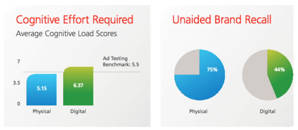
The three key metrics evaluated in the study were cognitive load (ease of understanding), motivation (persuasiveness), and attention (how long subjects looked at the content).
Direct mail requires 21% less cognitive effort to process than digital media (5.15 vs. 6.37), suggesting that it is both easier to understand and more memorable. Post-exposure memory tests validated what the cognitive load test revealed about direct mail’s memory encoding capabilities. When asked to cite the brand (company name) of an advertisement they had just seen, recall was 70% higher among participants who were exposed to a direct mail piece (75%) than a digital ad (44%).
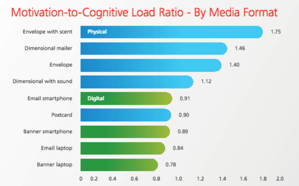
As a measure of overall effectiveness, the authors of the report calculate what they call the "motivation-to-cognitive load ratio," and say values greater than 1.0 are "most predictive of in-market success."
By their calculation, direct mail scored 1.31 compared to 0.87 for digital media. Here's how the individual formats fared:
While these measurements and metrics don't rise to the level of universal scientific standards, they seem to fit with other research in the paper vs. digital space.
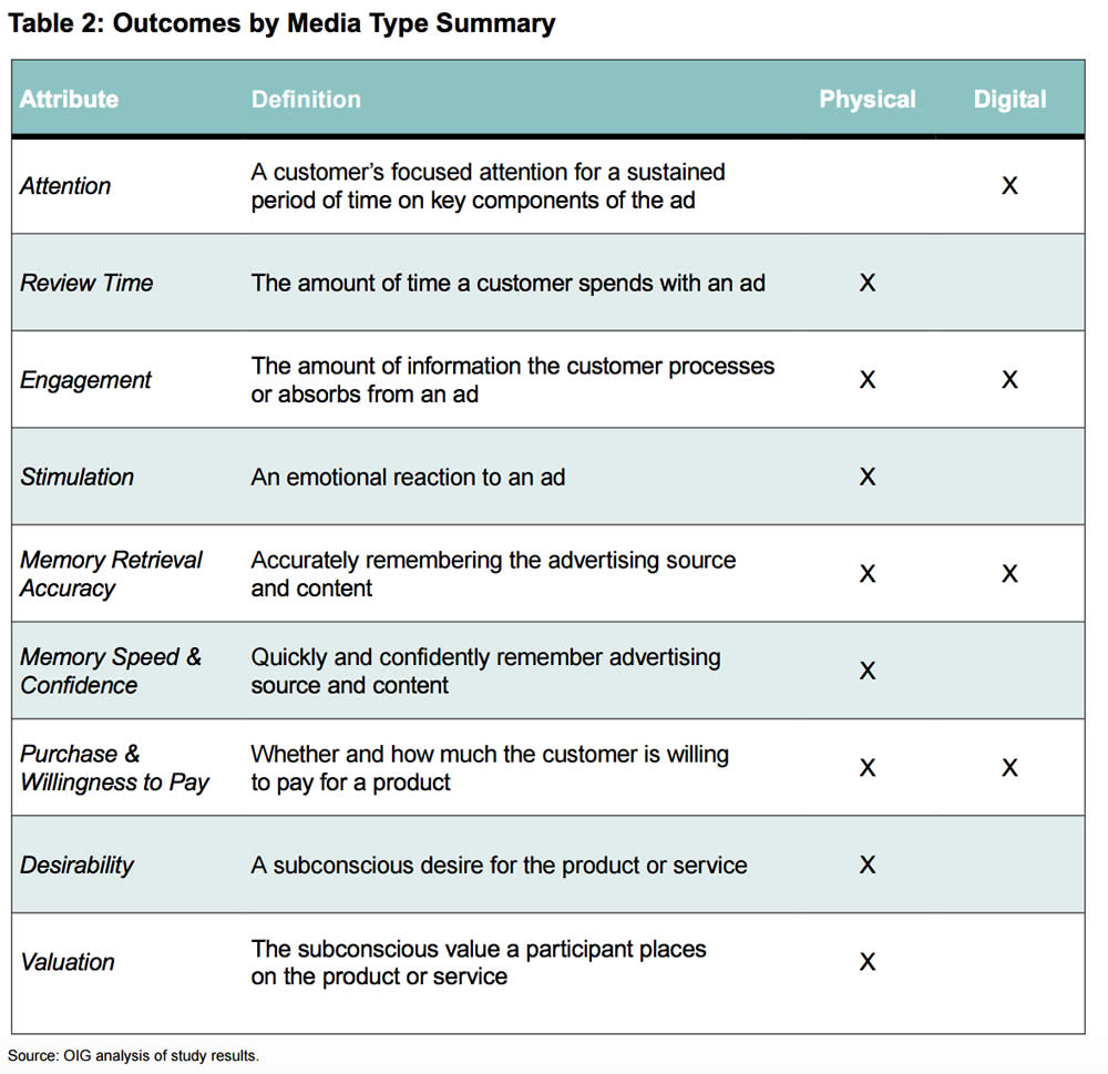
This study used fMRI brain scans to compare digital and paper. Their findings are summarized in this table:
Perhaps the most significant finding from the Temple study was that paper advertising activated the ventral striatum area of the brain more than digital media. A previous study of successful ad campaigns found that the ventral striatum was an indicator of desire and valuation.
While not quite the mythical "buy button," activity in this small brain structure had the highest correlation with advertising effectiveness. The study showed that ventral striatum activity was a better predictor than self-reporting by the subjects.
The fMRI approach used by the Temple scientists is the technique most widely used by academic researchers. While costly, fMRI studies can produce 3D images of brain activity. While their time resolution is lower than EEG, their ability to show activity in specific brain structures is valued by researchers.
A 2009 study conducted by Bangor University and branding agency Millward Brown also used fMRI to study the different effects of of paper and digital media.
Physical material involves more emotional processing, which is important for memory and brand associations.
Physical materials produced more brain responses connected with internal feelings, suggesting greater “internalization” of the ads.
Memory-Changing Power
A 2011 study showed that realistic print ads could actually change how subjects remembered an experience.
In Vivid Print Ads Change Your Memory, I describe how incorporating vivid images in ads actually caused subjects to remember consuming a brand of popcorn they had not actually tried. In addition, their attitude toward the product was more favorable.
In that study, the comparison was with print ads that had less imagery. But it seems likely that the same effect would occur if the study had compared large, vividly-illustrated print ads to ads viewed on a small screen like a smartphone or a tablet.
Reading, Comprehension And Recall
While the studies I describe above all compare the effects of print and digital advertising, quite a few scientists have looked at information or entertainment content. There's quite a body of work suggesting that our brains process a book differently if we read it in paper format vs. on an e-reader.
For example, a study in Norway concluded that, "students who read texts in print scored significantly better on the reading comprehension test than students who read the texts digitally."
Screen‐based reading behavior is characterized by more time spent on browsing and scanning, keyword spotting, one‐time reading, non‐linear reading, and reading more selectively, while less time is spent on in‐depth reading, and concentrated reading. Decreasing sustained attention is also noted.
The Message For Marketers
Science clearly shows paper can be more impactful and memorable than digital. Digital, meanwhile, offers its own huge advantages, including instantaneous access, localization, powerful personalization and targeting, audio and video, and more.
In addition to exploiting the customer's senses, paper may also be more effective for communicating detailed information. While most ads are designed to avoid any hint of information overload, sometimes a B2B sales effort may involve important documentation to ensure the customer needs are met. Providing this information in paper format may increase the customer's comprehension and recall.
Personally, if I'm presenting someone with a copy of my book, I always give them a hardcover copy. Not only can I inscribe it, but I know that it will have a physical presence in that person's world instead of disappearing in a Kindle library with hundreds of other little icons.
How complete is your business's transition from paper to digital? Has the pendulum swung too far? Share your thoughts in a comment!
Congratulations to Crown Connect for winning three 2017 Printing Industries Association of Southern California “Best of Category” awards. The annual PIASC Awards represent the best among submissions from all of its Southern California members.
Over the years Crown Connect has been the recipient of many of the PIASC awards including several prestigious Ben Franklin Awards, representing "Best of Category" in the national PIA competition.
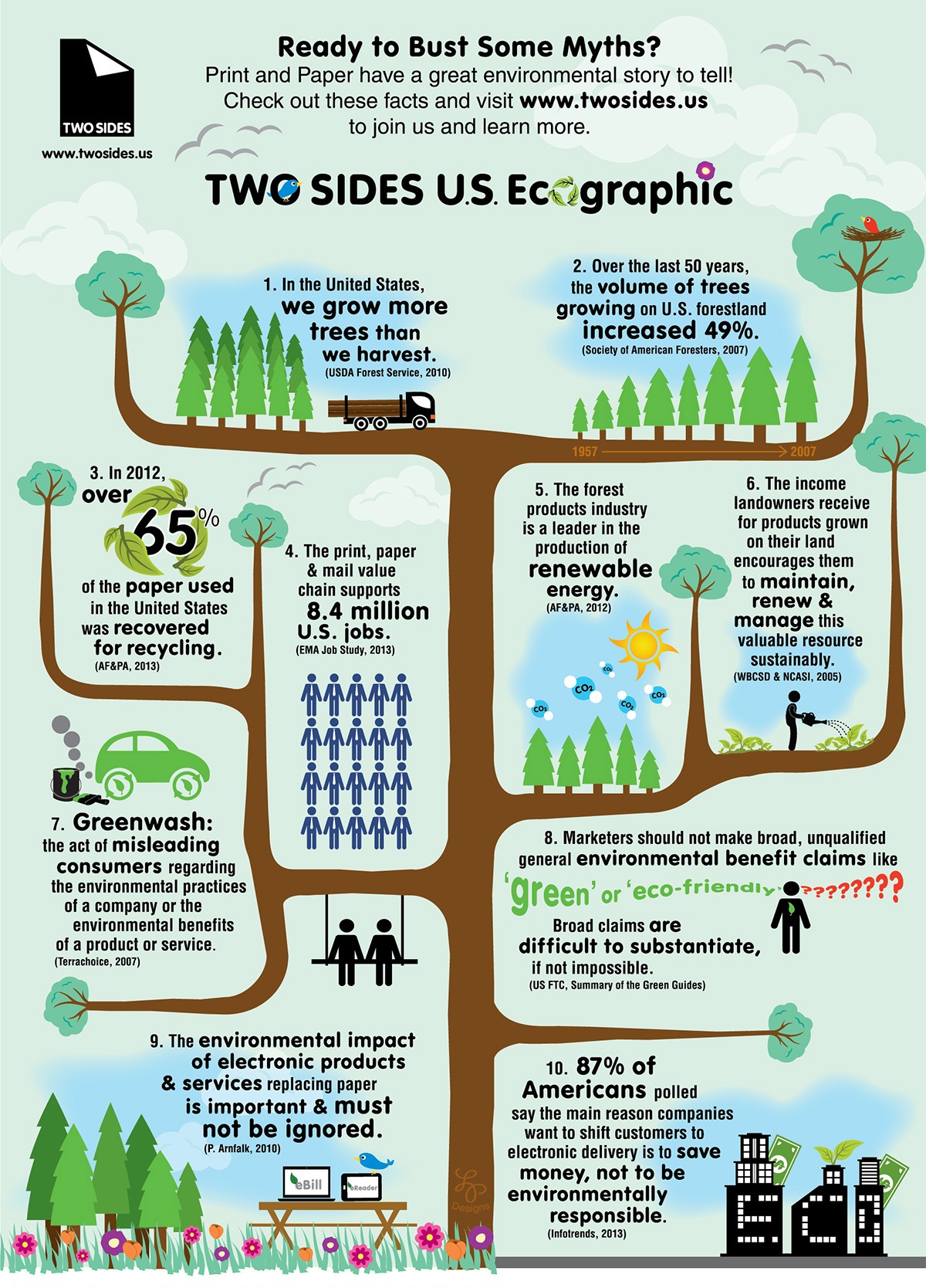
There are many misconceptions about the environmental impact of print on paper. Since printers and their suppliers use natural resources—trees—as a substrate for their products, many people think that by forgoing printing, they are saving trees and making the right choice for the environment. However, the exact opposite is true.
Print Values Trees
Much paper now comes from sustainable forests. These sustainable forests are essentially "tree farms," where trees are grown as a crop, just like broccoli or wheat. When these trees are harvested, new stocks are planted. Print gives landowners a financial incentive to renew forests rather than convert them for other uses, such as agriculture or development.[1] In fact, a number of investigators have suggested that efforts to protect forests primarily through non-market forces could, in fact, results in forest loss.[2]
Print Uses “Waste”
Overall, one-third of the fiber used to make paper comes from wood chips and sawmill scraps; another third comes from recycled paper.[3]In the United States, 76% of paper and paperboard mills use at least some recovered material in their manufacturing process in 2011, while 113 paper mills used recovered fiber exclusively.[4]
Print is Recycled
But that is not the complete story. Print on paper is recycled and reused. In 2015, a record-high 66.8% of paper used in the United States was recycled. This was aided in part by more deliberate curbside and drop-off collection systems.[5] Recycled paper is used to make everything from construction products to consumer goods.
Print is Responsible
Just 11% of the world's forests are used for paper, and in the U.S. the wood used to produce paper increasingly comes from certified forests.[6]The Forest Steward Council (FSC) and Sustainable Forest Initiative (SFI) track fiber content from certified lands through production and manufacturing to the end product.
From sustainable forests to the renewable nature of trees and the recyclability of paper, the print and paper industries have a positive environmental story to tell—one in which print on paper and healthy forests thrive hand-in-hand.
[1] Edward L. Glaeser, Professor of Economics, Harvard University, "A Road Map for Environmentalism," Boston Globe. [2]Dovetail Partners, Tree-Free Paper: A Path to Saving Trees and Forests?, revised August 19, 2014. [3]U.S. EPA, Office of Solid Waste, 2014. [4]American Forest and Paper Association, "Fun Facts," 2014. [5]Paper Recycles, Paper & Paperboard Recovery Statistics [6]International Paper, Down to Earth, "Is it Worth Printing? "


